Portfolio
Here you’ll find featured projects that highlight my process and results, plus examples of past work from a wide range of industries. No matter the field, my focus is always on creating designs that connect with the audience and reflect each client's mission, values, and goals.
J. Berens Pottery
Branding & Website
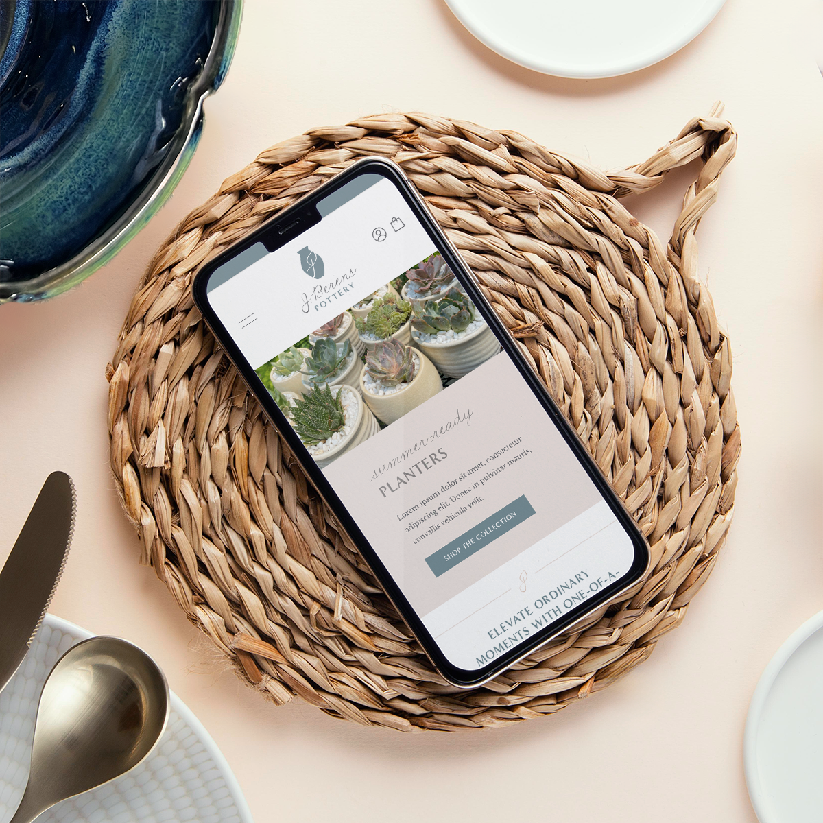
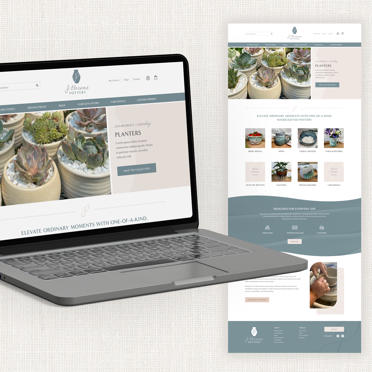
Jessica Berens of J. Berens Pottery is an independent artist in the Chicago area that creates handmade, functional pottery that elevates everyday moments. Her beautiful new branding and custom website gives her business a more polished, professional look that emphasizes the cozy, coastal vibe she loves with elements of nature incorporated throughout.
Design NotesJessica’s new brand reflects her emphasis on natural, organic shapes and flowing designs, and reinforce the unique, one-of-a-kind quality of her work.
This color palette of soft creams, grays and blues creates a sense of tranquility and comfort.
A script font in a handwritten style adds a custom look and feel and is reminiscent of the signature on the bottom of the pottery pieces.
The graceful movement of the letter J swoops into a leaf shape to incorporate themes of nature reflected in the pottery.
Sheridan Singers
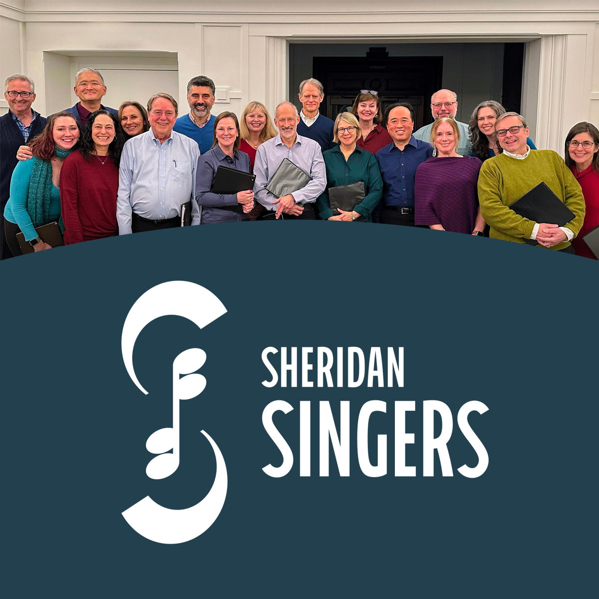
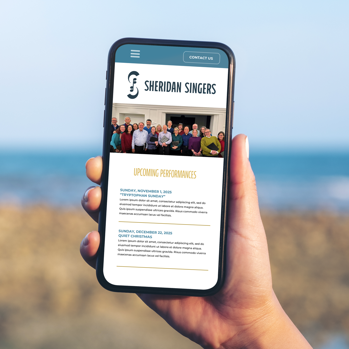
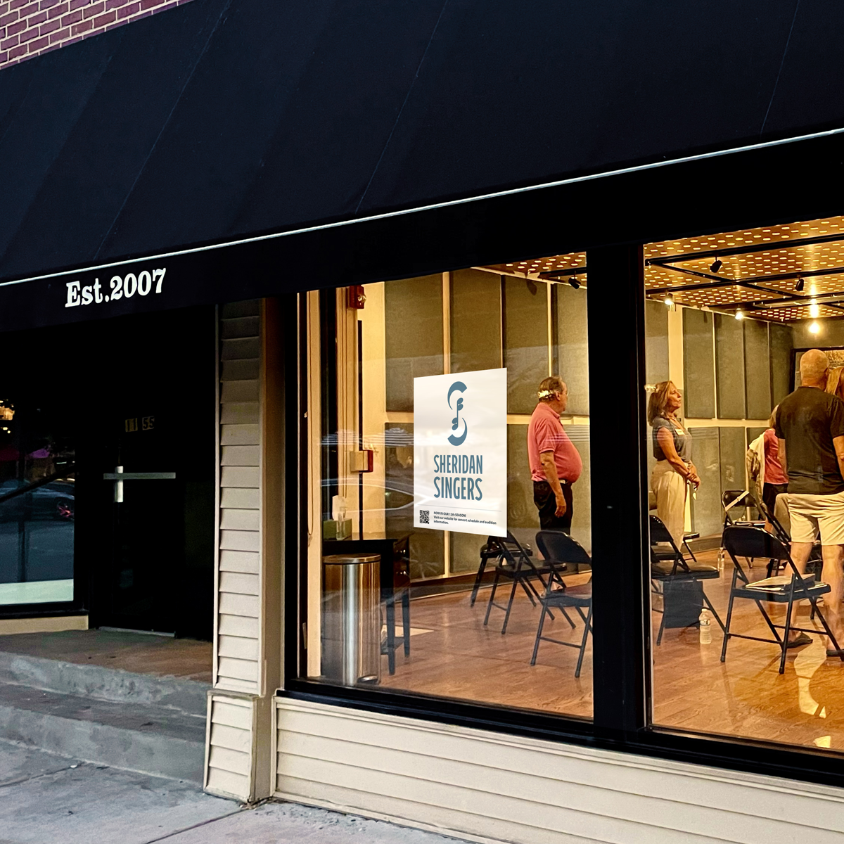
The Sheridan Singers is an a cappella choir located in Chicago’s North Shore. The group had been using a DIY logo for years and was in need of a refresh that would better represent their standing as a high-quality choral ensemble.
Branding
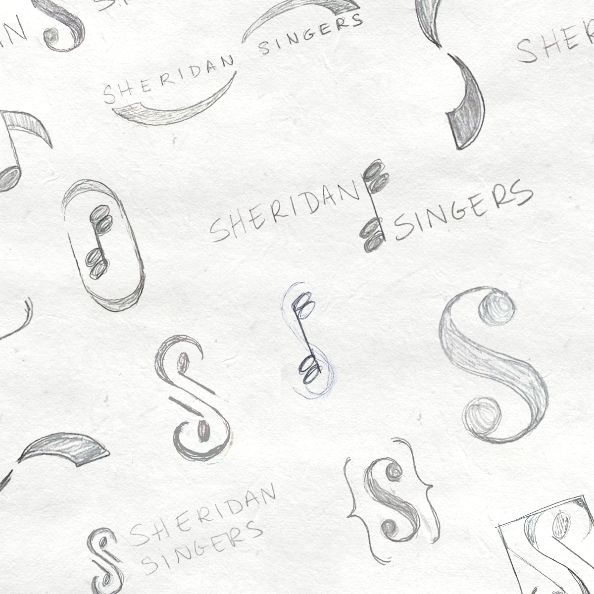
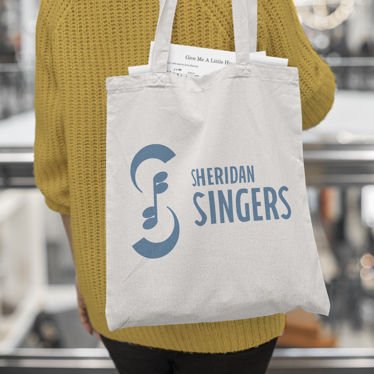
Design NotesThe new logo creates an S shape with two semi-circles symbolizing the “choral arc” (the shape a choir stands in when performing).
The musical note motif in the center of the logo symbolizes the group singing in 4-part harmony.
The thick/thin curves of the letter “S” were inspired by the gentle curves of Sheridan Road, a well-known thoroughfare in the North Shore area.
The music note element is embraced by the shapes of the letter “S” to create a feeling of camaraderie and togetherness.
The font is tall and elegant with subtle styling that mimics the shape of the letter S in the symbol.
The color scheme was inspired by Lake Michigan - an integral part of the scenery in Chicago’s North Shore.
Before starting Ovation Creative, I spent many years designing for a wide variety of businesses and organizations, including:
Libraries
Park Districts
Non-Profits
Lawyers
Dentists
Fitness Studios
Veterinarians
Day Care Centers
Churches
Municipalities
Hair Salons
Musicians
Food & Beverage
Some of my favorites…Like what you see?
Let’s chat!


